...
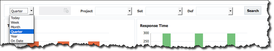
The data displayed can be filtered by time range (e.g. Today, Week, Month, Quarter, Year, or Exact Date), by Project, Test Set (Set), and and Test Definition (Def).
Test Results
The Test Results chart displays a bar graph representation of test execution results across environments. Hovering your mouse over the graph will identify the exact percentage corresponding to each test result (such as Passed, Failed, Error, and Skipped), and for what environment.
...
The Response Time chart displays a bar graph representation of Minimum, Maximum, and Average response time in milliseconds while running tests across environments. Hovering your mouse over the graph will identify the exact response time values for the environment. Note, that the
| Note |
|---|
The data on this chart depends on |
...
testing tool used. Not every testing tool reports information about response time. For example, TestNG does and JUnit do not. |
Duration over Time
The Duration over Time line graph shows the average test execution times by environment. By hovering your mouse over the line, a text box will appear showing the exact amount of time it took for that test execution, and to which environment.
...